Art Of Balance
Humans naturally seek out symmetry and, according to Gestalt psychology, we tend to perceive objects as symmetrical shapes that form around a center point. That’s why balance is one of the key principles of design.
Balance in art is one of the basic principles of design, along with contrast, movement, rhythm, emphasis, pattern, unity, and variety. Balance refers to how the elements of art (line, shape, color, value, space, form, texture) relate to each other within the composition in terms of their visual weight to create visual equilibrium.
Visual balance is essential because it provides a sense of unity, order, and equilibrium. Your design needs to visually “hold together” in order to feel complete and harmonious. But to be clear, balance doesn’t mean everything should be perfectly symmetrical. It just means that the visual weight of objects, space, and color is equally distributed across the page. Without balance, a design feels off-kilter, inconsistent, and unsettling.
Read on to discover the four types of balance in art and design, and learn how to achieve them in your own work.
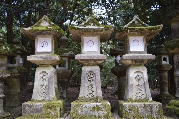
1. Symmetrical Balance
With symmetrical balance, you could draw a line down (or across) the middle of the project to create a mirror image. This perfect bilateral symmetry feels elegant, formal, and conservative.
The images above illustrate how visual weight is very even and tidy on each side. Wedding invitations, theater programs, and poems are often cited as examples where symmetrical balance is used (think center aligned text and symmetrical layouts).
However, pure symmetrical balance can feel boring, dull, and constrained, so try to mix it up with other types of balance too.
2. Asymmetrical Balance
Asymmetrical balance creates tension through contrast and is much more visually interesting. Because it’s abstract, there is no symmetry; there are no perfect mirror images. Instead, you’re arranging elements of all different visual weights in such a way that each side is still balanced out. The “heavier” elements will jump forward and catch the eye more than the “lighter” ones, which will recede.
This type of balance feels more casual, free, and energetic. To equalize the weight throughout your design, you can play around with these different factors that affect visual weight:
- Size: Large items seem heavier than small ones.
- Value: Dark items feel heavier than light items.
- Color: Warm, bright colors are more eye-catching than cool or neutral, muted ones. Red is considered to be the “heaviest” and yellow is the “lightest.” (For more info, check out our basics of color temperature post!)
- Texture: Objects with texture appear three-dimensional and feel physically heavier than objects without texture.
- Quantity: A few small objects can balance out a single large object.
- Isolation: An item by itself is more eye-catching than an item that’s one of many. (Wondering why? Think about negative space.)
- Orientation: Diagonal elements are heavier than vertical and horizontal ones.
3. Radial Balance
In radial balance, elements radiate out (in a circular shape) from one main center point. If you’re looking to create a strong focal point, radial balance is an effective technique because your eyes are naturally drawn inwards to the center.
Not only do the swirls of the nautilus shell and spiral staircase provide visual interest, but they also naturally lead your eye right to the center of the image.
4. Crystallographic Balance

Also called mosaic or “allover” balance, this type of balance is about repetition. At first glance, images employing crystallographic balance can seem random and chaotic; it might look like visual noise since you can’t identify a distinct focal point or visual hierarchy right away. But believe it or not, it works.
Remember, repetition and consistency are major design principles, and by evenly repeating elements with equal weight throughout the design, it actually creates a sense of balance. You can see that the same colors, shapes, and sizes are repeated throughout each image. The wall repeats the same bright, bold colors; the colored pencils all have the same hexagon shape; the doughnuts are all uniformly sized. Wherever you look, you’re consistently seeing the same visual weight. Fract osc.
Balance is an important principle in many aspects of our lives, and it applies to design too. If your design lacks balance, it can feel “off” and ineffective. When you’re designing, don’t just stick to pure, static symmetry; try experimenting with different kinds of balance and playing around with visual weight. See what works best for your brand, project, and tone. You might find that you can use balance and symmetry in new, exciting ways that you’ve never used before.
Top image: Top view of quail eggs in a wooden spoon on a green background by anastasiafotoss
Senjō no Valkyria 3: Unrecorded Chronicles, commonly referred to as Valkyria Chronicles III outside Japan, is a tactical role-playing video game co-developed by Sega and Media.Vision for the PlayStation Portable. Released in January 2011 in Japan, it is the third game in the Valkyria Chronicles series. Valkyria chronicles 3 characters.
Available for the 2019 season beginning 12/01/2018. More details soon! Please visit www.themusicofalexthode.comRepertoire:- 'Gymnopedie No. 1' - Erik Satie- 'Symphony for Brass and Percussion' - Alfred Reed- 'Hallelujah' - Leonard Cohen- 'The Sound of Silence' - Simon & Garfunkel- 'Fly to Paradise' - Eric WhitacreOrignal music by Alex ThodeFront ensemble, battery, and sound design arranged by John HerndonCommissioned by the Milton High School Marching Band (GA) - Mr. Chris Shumick, Director*ALL WORKS MENTIONED ARE COPYRIGHTED BY VARIOUS COPYRIGHT OWNERS, AND WILL REQUIRE LICENSING PRIOR TO THE CREATION OF AN ARRANGEMENT FOR YOUR GROUP.*